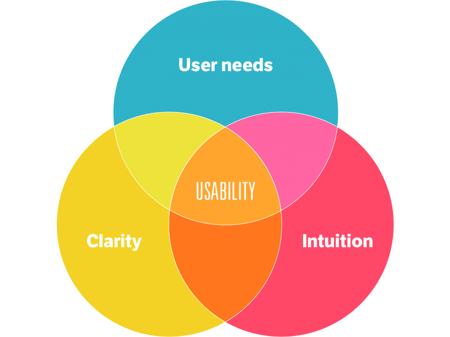
One of the main goals of any website project is to produce a website that is easy to use. Usability is sometimes reduced down to “easy to use,” but it really is so much more. I could write a whole article about the definition of usability, but today I’d like to jump straight to a few tips that can be applied to your existing site, gleaned both from my professional experiences and Steve Krug’s awesome book, Don’t Make Me Think: A Common Sense Approach to Website Usability.
Five-Second Rule
Pause for a moment to take a deep inhale and exhale. That’s all the time you get from a website visitor. In order to earn a second breath, your website needs to communicate your message clearly to the user and provide them with the appropriate next steps.
This rule doesn’t just apply to first impressions of your homepage; consider the five-second rule as it pertains to accomplishing basic tasks on your site, like finding out when fall semester applications are due. Users typically just dive in, muddling through your site, quickly scrolling and clicking to get what they want. They don’t take the time to analyze your entire page and pick the best choice. Realistically, they look feverishly around for anything that is interesting or vaguely resembles what they are looking for, and then they click! If they mistakenly click the wrong link, the back button is a painless exit to try again.
Write to Scan
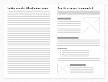
Building off the five-second rule, it’s important to write your copy so that it is best suited for scanning or skimming. How do you do that? One word: hierarchy. Take any long-form content and try to make an outline of it. How can you break it out into sections and subsections? Now write headlines for each of those. Format the remaining copy with short paragraphs, bulleted lists, quotes, call-outs, etc. to make the content scannable.
Most people think of their website as a hub for all the content they’ve ever created for their organization. They’d love to envision their users reading each and every word but, realistically, that just isn’t going to happen. In fact, eye tracking studies show that 80 percent of users’ viewing time is spent above the fold.
According to Ruffalo Noel Levitz’s 2018 E-Expectations Report (registration required), having to read too much content and not being able to find enough relevant content ranked as the top complaints from students visiting college and university websites. That points to a serious editing problem in the higher ed space. Think of your site as a billboard, not a book. In reality, users are ruthlessly scanning and scrolling just as if they were screaming past a billboard at 65 miles per hour. They’re usually on a mission, skimming and looking for words or phrases that catch their eye. In addition to formatting your copy with hierarchy, it would probably be wise to take a red pen and make some revisions.
Omit needless words, stop writing long introductions, kill fluffy paragraphs that don’t actually say anything, and avoid redundant talking points to cut down on the amount of copy your users will have to scan. Every page of your site should provide users with the information they’re looking for—no more, no less—and give them an appropriate next steps to take.
Your Web User is Boss
We are all users of the web, but you are not your website’s user. Check your strong loves and hates about your preferred web experience at the door. When crafting your website (strategy, design, development or copy), it’s important to always keep your real web user and the considerable body of web usability research at the front of your mind. So don’t reject an idea because you hate using dropdown menus or ditch the search box because you believe nobody searches websites anymore, and don’t write in a tone that appeals to you but could be off-putting to your user.
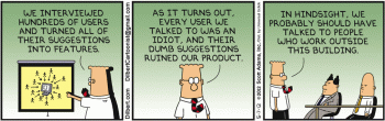
You also shouldn’t use generalizations to defend a decision (everybody hates sliders, nobody knows what that icon means, etc.). There is no “typical” web user. There’s no single right answer. What does work is good, integrated design that fills a need; carefully thought out, well executed and tested. Keep this in mind as you organize your content. Don’t organize it around your org chart or how you find information internally. Your site’s main audiences are typically prospective students, parents, donors and the community—not your faculty, staff or leadership team.
Eliminate all Uncertainties
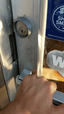
Have you ever walked up to a door with a handle and intuitively pulled, only for it not to budge? It’s then you notice the PUSH sign and feel like a big dummy. Experiences like this are all over the web. Doors shouldn’t require instructions, and the same goes for your website. Underlined links, hover effects on buttons or even buttons that look like buttons are all visual cues to the user. When those visual cues don’t match the expectation that the user has, their brain has to stop and re-evaluate:
Is this a link?
What does this mean?
Where do I need to go next?
When users are uncertain, they leave. Eradicating uncertainty is key to creating an experience your users will delight in. Even something as simple as changing a link from Learn More to a more detailed option like Learn About Our History does a lot to communicate what will happen when the link is clicked. Take every effort to make your site as self-explanatory as possible.
Keep It Clean
The infinite vertical canvas of a website makes it easy to cram in every bit of important (and unimportant) information your users may need because, technically, you can find room for everything. However, it’s important to have tough conversations with your team about hierarchy and relevance.
If users are overwhelmed with information, they’ll feel confused and will eventually abandon their effort to find whatever it is they’re looking for. Avoid the temptation to make everything important by cramming too many options into your menus or incorporating an excessive number of competing calls to action within your copy. As a designer, I often have to fight for simplicity and clarity (and white space!), but it’s not about making things pretty. In the end, it’s not the designer that suffers, but the user (although I will feel a bit ill about it). Be mindful of usability and eliminate points of cognitive friction on your site, and I guarantee you’ll come away with a product that your users will enjoy.
Want to learn more about creating a more usable website? Consider picking up the book Don’t Make Me Think: A Common Sense Approach to Website Usability by Steve Krug. We love the book’s approachable, easy-to-read style. It does a great job bringing best practices to life with relatable examples and a splash of humor. >Check it out