
Some people think print is dead — that fewer people are printing things and it’s all going digital. But there is still a very large portion of your brand that calls back to traditional elements.
Each month, I get a water filter in the mail from a company called Soma and the packaging is beautiful. The design of the packaging creates an elegant, quality experience. In the end, it doesn’t feel like something you regret buying.
Our sense of touch is really important. It’s one of the first impressions you make with your audience and they’ll notice when things are well thought out. At the end of the day even the smallest details are noticed – from the type of paper you choose to the size and dimension of a printed piece. Maximizing these details will ultimately connect with them.
Tactile design is all the touch and feel aspects of a design project. These are things that you don’t necessarily design on the computer — it’s how you can deliver a feeling the first moment that someone interacts with the design.
Wise Use of Tactile Design in Invitations
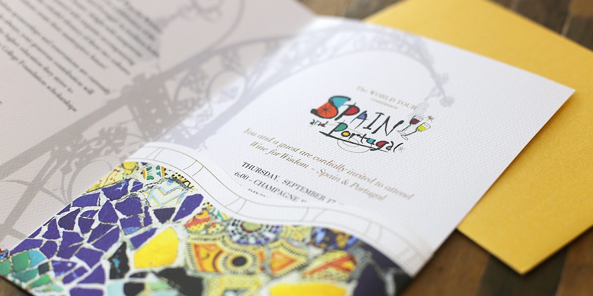
Every year one of our clients, Polk State College, puts on their signature fundraiser for their foundation. Chris puts the invitations together with Cathy, and when you open them, you are always put in in the mindset that “this is going to be a really elegant evening.”
Every aspect of the invitation – from the envelope to the woven texture of the paper draws you into the copy and the design. It solidifies the thought that you want to attend.
In the example above, Chris had done a unique die-cut that makes unfolding it a novel experience. Not only does it look amazing, but it takes into account the physical interaction someone is going to have as they open up the invitation.
High-End isn’t Prescriptive, It’s Coordinating
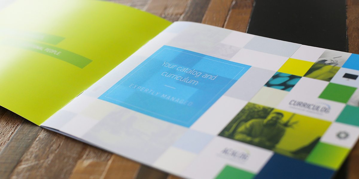
In the brochure above for DIGARC, we were also going for a high quality feel — but this time for a technology company, so the approach was quite different.
On this project we chose a paper featuring characteristics that would support the messaging of their high-quality and professional products.
By choosing a larger format, we were able to create open spaces that let us drill down tothe messaging we were trying to get across.
Tactile Design in a 3-Dimensional Product

This is the St. Leo University admission packet for 2016, which went out to admitted students in August.
In order to make a strong first impression we chose gold foil for the cover of the mailer. As a student takes this out of their mailbox, they’ll immediately be excited to find out what waits for them inside.
Once you open it, you get a little bit of additional detail on the edge of what’s coming up as you open it up and then the congratulations.
As you unbox the package you also get a sense for the experience that Saint Leo has in store for you. Beyond the mailer itself, the booklet inside was printed on a soft touch paper which creates a unique feel to the booklet. We were also able to emphasize certain key messages throughout using a spot coat treatment.
As I made a prototype of the box, I made sure to look at it from the perspective of an admitted student. I then made sure that each aspect of the design would guide them through. Even if the user doesn’t take into account or think about those details, subtle hints guide them through the experience.

The experience that we created for Saint Leo in their admissions package helped to set them apart from other universities. Maximizing efforts in terms of the senses can really impact your audience’s decisions and make a lasting impression on how they perceive your brand.
User Experience in the Physical Realm
In good design, every detail in the process is well thought out, including the tactile experience, otherwise the overall effect might not leave a lasting impression on your audience. Utilizing a tactile experience commands attention and will set your brand apart from the competition.